The Langmuir Optimization Program
| Alfisol, Item 003: | LMMpro, version 2.0 The Langmuir Optimization Program |
|
|
|
Do try to minimize data error and to use as many data points as possible. Try to have an even spread of the data on the plots, so as to have data present in low, medium and high concentration ranges.
Do be sure to use all of your original data for your final graphs, reports, and publications. Keep an eye on the "N = xx of xx" in the lower left corner of the graph. It is there to remind you if any data have been dropped for the current regression results being displayed. (N = number of data points being used out of the total number of data points available.)
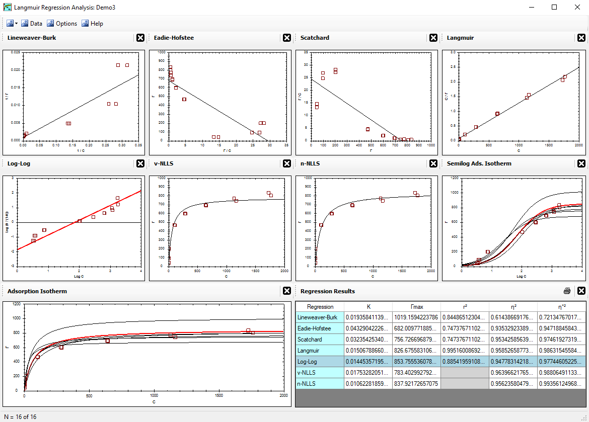
Do present your conclusions about the goodness-of-fit of the data by
showing the original untransformed data and graph with the optimized regression curve drawn.
Showing the transformed data and graphs is to be strongly discouraged because it can be potentially very misleading.
If a linear regression was used to optimize the equation parameters, it does not mean that
the linear regression and its transformed data are more important than the original graph and its
untransformed data.
Do report the goodness-of-fit of your optimized equation on the untransformed data set. Use either the η2 or η*2 values for this.
Do compare the regression results among the various regression methods using only the η2 or η*2 values.
Do not compare the η2 value with the η*2 value (even if both are applied to the same graph) because they refer to different goodness-of-fit criteria.
Do not use r2 to descirbe the goodness-of-fit of the original untransformed graphs. The r2 correlation coefficient is for the transformed plots only. It describes the goodness-of-fit of the regression line on the transformed data.
Do not compare the r2 of one regression method with the r2 of another regression method. The r2 value describes the goodness-of-fit of the regression line for a specific graph. If either the y-axis or x-axis units change, then the corresponding r2 values of these two graphs cannot be compared. Such a comparison is nonsensical.
Do not compare the r2, η2 or η*2 values of a given regression method. They each refer to different criteria for the goodness-of-fit.
Do not forget that this computer is just a machine. It does have some computational limitations. These limitations can be easily displayed when using very few data points in the lower left portion of the graph, especially when using just a few points that also do not fall on the typical path of a parabolic equation. Computer failure to do the math correctly nearly always results in a regression curve that is not anywhere near the middle of the cluster of data points used in the optimization procedure. When a regression analysis results in a predicted curve that does not pass through the center of the group of data points, plus the optimized parameter values are enormously large or small, then you know that the computational limits have been exceeded. If the optimized parameter values are indeed very large or very small, but the regression curve predicted remains near the middle of the cluster of data points used, then you are probably still well within the computational limits of your computer.
Do not rely too heavily on your conclusions and do not overstate your conclusions when your conclusions are based on just a few data points that were collected over a narrow range of conditions. Increase the range of your data, and get as much data as possible. If you have a cluster of data in one region of the graph, then your confidence of the results in that region of the graph will increase. However, if that region of the graph happens to correspond to a non-parabolic behavior in your particular experiment (that is, you have a slight theory error that is expressed in that region of the graph), then a large cluster of data in that region of the graph will affect the entire regression results. Therefore, do try to collect data evenly across all regions of the graph. The log-log and semilog graphs are especially useful for determining if the data are evenly collected across all regions of the graph.
Do not ignore data. It is very risky and sometimes unethical to do so. This LMMpro allows you to ignore data with just a click of the mouse in the Data window, but this practice is only to help you play with the data and thus evaluate various "what if" situations. These various "what if" situations, when used correctly, can help you locate areas on the graph that are displaying some kind of error, such as data error or theory error. You can then proceed with a plan to determine if problems exist with the data (such as precision and/or accuracy) or with the theory. In general, it will be difficult to detect any theory error if there is also some concern with the precision or accuracy of the experimental data values.